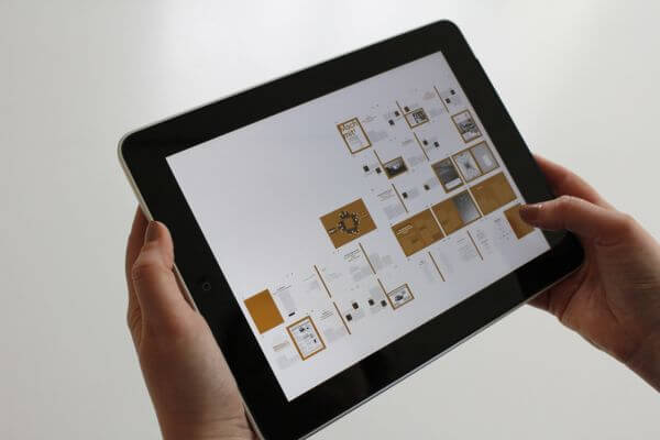
In today’s digital landscape, users access websites and applications on a wide range of devices, including smartphones, tablets, laptops, and desktop computers. Designing for multi-device compatibility is crucial to ensure a seamless and consistent user experience across all platforms. In this article, we will explore strategies for designing websites and applications that are compatible with different devices, enabling users to access and interact with content effectively.
- Understanding Multi-Device Compatibility
Multi-device compatibility refers to designing and developing websites and applications that work seamlessly across various devices, screen sizes, and orientations. It involves adapting the design, layout, and functionality to provide an optimal user experience regardless of the device being used.
- Responsive Web Design
Responsive web design is a key strategy for achieving multi-device compatibility. It involves designing and building websites that automatically adjust and adapt to different screen sizes and resolutions. Responsive websites use flexible grids, fluid layouts, and media queries to ensure optimal viewing and interaction experiences on various devices.
- Mobile-First Design Approach
The mobile-first design approach involves prioritizing the design and development of websites for mobile devices first, before scaling up for larger screens. With the majority of internet users accessing websites through mobile devices, starting with mobile design ensures that the core functionality and user experience are optimized for smaller screens. This approach helps create a more streamlined and efficient design process.
- Adaptive Design
Adaptive design involves creating multiple versions of a website or application that are specifically tailored to different device types. Rather than relying solely on responsive design techniques, adaptive design allows for more granular control over the user experience on each device. It detects the device’s capabilities and delivers a customized version of the website or application that best suits that particular device.
- Content Prioritization and Progressive Enhancement
When designing for multi-device compatibility, it’s essential to prioritize and optimize content for different screen sizes. Content prioritization involves identifying the most critical information and ensuring it is prominently displayed on all devices. Progressive enhancement is a strategy that focuses on delivering a core experience to all devices and then enhancing the experience with additional features and functionalities on devices with more capabilities.
- Touch-Friendly Interactions
With the prevalence of touch-screen devices, designing touch-friendly interactions is crucial for multi-device compatibility. This involves considering the size and spacing of interactive elements, such as buttons and links, to ensure they are easily tappable on smaller screens. Providing visual feedback and minimizing the need for precise gestures can enhance the usability and accessibility of touch interactions.
- Performance Optimization
Optimizing performance is essential for delivering a smooth and efficient user experience across different devices. This includes optimizing file sizes, compressing images, minifying code, and leveraging caching techniques to reduce load times. Performance optimization not only improves the user experience but also positively impacts search engine rankings and overall website accessibility.
- User Testing and Iteration
User testing is a critical step in ensuring multi-device compatibility. Conducting usability tests with users on different devices can reveal any usability issues, inconsistencies, or areas for improvement. By gathering user feedback, designers can iterate and refine the design to address any issues and provide an optimal user experience on all devices.
- Conclusion
Designing for multi-device compatibility is essential to meet the diverse needs and preferences of users accessing websites and applications across various devices. Responsive web design, mobile-first design approaches, adaptive design, content prioritization, touch-friendly interactions, performance optimization, and user testing all play integral roles in achieving multi-device compatibility.
By implementing these strategies, designers can create websites and applications that seamlessly adapt to different screen sizes, resolutions, and device capabilities. Ultimately, designing for multi-device compatibility enhances the user experience, increases engagement, and ensures that content is accessible and usable across all devices, leadingto a satisfied and engaged user base. With the ever-increasing variety of devices on the market, designing for multi-device compatibility is a fundamental aspect of modern web design that cannot be overlooked. By embracing these strategies and considering the unique characteristics of each device, designers can create experiences that delight users and ensure their content is accessible to all.


